

Steel Building Colors: Panel and Trim Options
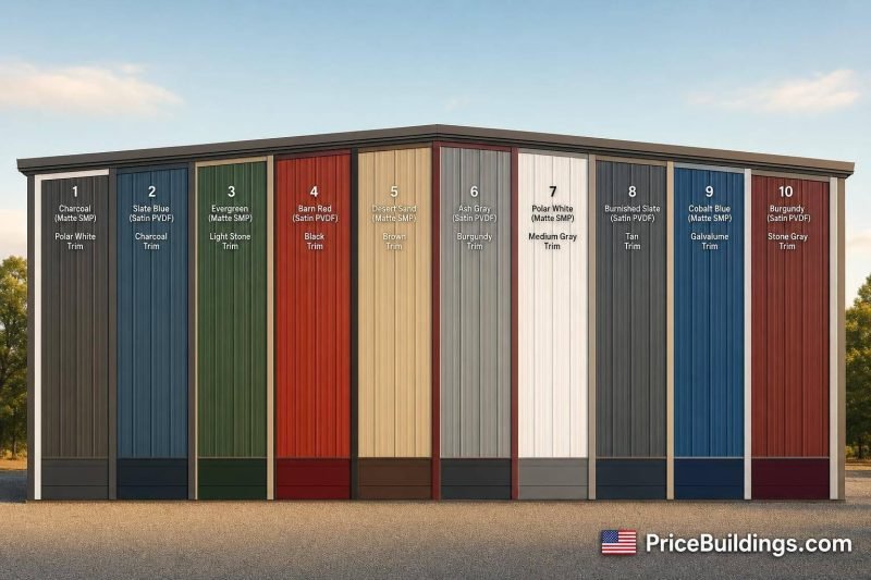
Most steel building buyers keep the color plan simple: 1 wall color, 1 roof color, and 1 trim color. In most cases, U.S. suppliers offer about 15 to 20 factory-finished colors, split into standard and premium groups, with White often used for walls and Galvalume often used for roofs.
If I wanted the short answer, I’d say this:
- Light colors like White, Light Stone, and Ash Gray help with heat control
- Dark colors like Charcoal, Brown, and Black hide dirt better
- Trim usually looks best when it matches the roof
- Two-tone wainscot is a smart pick for mud, splash, and scuffs on the lower 3 to 4 feet
- SMP is common for standard use, while PVDF is the better pick for strong sun, coastal air, and longer color life
- 29-gauge panels often carry 10- to 20-year paint coverage, while 26-gauge panels may come with 40-year coverage
- Moving from 29-gauge to 26-gauge can add about 10% to 15% to base cost
The article also walks through 10 common color pairings:
- White panels + Charcoal trim
- Light gray panels + Dark gray trim
- Beige panels + Brown trim
- Tan panels + Bronze trim
- Barn Red panels + White trim
- Evergreen panels + Beige trim
- Slate Blue panels + White trim
- Charcoal panels + Black trim
- Custom colors for steel garage buildings
- Off-white panels + Galvalume-style roof and matching trim
- Two-tone neutral panels + dark wainscot and matching trim
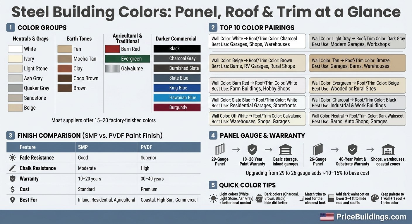
Steel Building Color & Finish Guide: Panel, Roof & Trim Options
Metal Building Color Schemes | Steel Buildings | Metal Buildings – General Steel Buildings 101
Quick Comparison
| Color scheme | Best fit | Main reason to pick it |
|---|---|---|
| White + Charcoal | Garages, shops, warehouses | Clean contrast |
| Light Gray + Dark Gray | Modern garages, workshops | Low-contrast gray look |
| Beige + Brown | Barns, RV garages, rural shops | Warm neutral look |
| Tan + Bronze | Garages, barns, warehouses | Soft contrast |
| Barn Red + White | Farm buildings, hobby shops | Classic farm style |
| Evergreen + Beige | Wooded or rural sites | Blends into surroundings |
| Slate Blue + White | Residential garages, storefront shops | Cooler modern look |
| Charcoal + Black | Industrial and work buildings | Hides dirt well |
| Off-white + Galvalume | Warehouses, shops, garages | Simple neutral setup |
| Neutral + Dark Wainscot | Barns, auto shops, garages | Hides splash and scuffs |
Bottom line: I’d pick colors based on heat, dirt, and finish life first, then style. Keep the palette tight, match the trim to the roof, and lock in the full wall-roof-trim package before ordering. You can also estimate your project costs to see how different options fit your budget.
How Steel Building Color Charts Are Organized
U.S. suppliers usually sort steel building color charts into four broad groups: neutrals and grays, earth tones, agricultural and old-standby colors, and darker commercial shades.
Put simply, most supplier charts use four buckets. That setup makes it easier to compare wall, roof, and trim choices at a glance instead of bouncing around a long color list.
| Color Group | Common Options |
|---|---|
| Neutrals and grays | White, Ivory, Light Stone, Ash Gray, Quaker Gray, Sandstone, Beige |
| Earth tones | Tan, Mocha Tan, Clay, Coco Brown, Brown |
| Agricultural and traditional | Barn Red, Evergreen (Forest Green), Galvalume |
| Darker commercial | Black, Charcoal Gray, Burnished Slate, Slate Blue, King Blue, Hawaiian Blue, Burgundy |
Galvalume is often the default roof finish, while White is often the standard wall color. Trim usually defaults to match the roof color unless you specify otherwise.
That detail matters more than it may seem. If you want contrast – say, charcoal trim with light gray panels – call it out early so the order form reflects the look you want.
Painted Finish Options for Steel Panels and Trim
Color shapes the look. The coating decides how well that look holds up over time.
After you pick a color, compare the finish. SMP and PVDF are the two common painted options. PVDF sits at the higher end and makes more sense for buildings that get a lot of sun or rough weather, since higher-grade coatings tend to last longer under harsher conditions.
Panel gauge matters too. It doesn’t just affect panel strength. It also plays a part in finish life and warranty coverage. Standard 29-gauge panels usually come with a 10- to 20-year paint warranty, while 26-gauge panels often include 40-year coverage on both the finish and substrate. That upgrade usually adds about 10–15% to the base cost.
| Panel Grade | Gauge | Paint Warranty | Best Use Case |
|---|---|---|---|
| Residential Standard | 29-gauge | 10–20 years | Basic storage, inland garages |
| Commercial Grade | 26-gauge | 40 years | Shops, warehouses, coastal zones |
Care matters just as much as the finish you buy. Rinse the exterior every quarter and touch up scratches right away with manufacturer-approved paint to help stop rust before it starts.
With the finish narrowed down, the next move is pairing wall, roof, and trim colors in a way that looks clean without making the design feel busy.
1. Classic White Panels With Charcoal Trim
White and charcoal is one of the easiest ways to get a crisp, high-contrast look from a standard color lineup. White panels help cut heat gain and give the building a clean, neutral base. Charcoal trim sharpens the outline and adds clear edge definition.
Best building use
This pairing works well for garages, shops, barns, and warehouses.
Wall-roof-trim contrast
You can match the roof to the charcoal trim for a sharper look. Or go with Galvalume if you want a cleaner roof with less contrast.
Paint finish fit
Use a durable finish on the white panels and a low-gloss dark finish on the charcoal trim, especially in high-sun areas.
If you want something a little softer, the next pairing moves into gray-on-gray contrast.
2. Light Gray Panels With Dark Gray Trim
Light gray panels with dark gray trim give a clean, low-contrast look. It’s simple, sharp, and still gives the building enough definition to stand out.
Best building use
This color mix fits well on modern residential garages, professional automotive workshops, light manufacturing facilities, and contemporary barndominiums.
Wall-roof-trim contrast
Keep the palette tight. Light gray panels reflect sunlight, and dark trim outlines the roofline and corners without making the contrast feel too strong. Light gray panels, often sold as Ash Gray or Quaker Gray, work well with dark gray trim such as Charcoal or Pewter Gray. In most cases, matching the roof to the trim gives the cleanest look.
Ash Gray, Quaker Gray, Charcoal, and Pewter Gray are common standard colors at major suppliers.
Finish fit: SMP vs. PVDF
SMP is the lower-cost pick for inland buildings. PVDF is the better fit in high-sun or coastal locations.
| Feature | SMP | PVDF |
|---|---|---|
| Upfront cost | Standard / economical | Premium / higher upfront |
| UV resistance | Moderate | Superior |
| Best for | Inland residential, storage, agricultural | Coastal, high-heat, commercial |
| Durability | High impact resistance | High chemical and weather resistance |
This pairing keeps the building easy to read and leaves room for stronger contrast in the next color options.
3. Beige Panels With Brown Trim
After the cooler gray options, beige and brown bring in some warmth without making the building feel too busy.
Beige panels with brown trim give you a low-contrast, classic look. It fits especially well on barns, workshops, RV garages, and barndominiums.
Best building use
This color pairing works well for agricultural barns, residential workshops, RV garages, and barndominiums. It also fits nicely into rural settings and homes with a more classic look.
Wall-roof-trim contrast
Light beige or tan panels set a neutral base. Dark brown trim – often sold as Coco Brown or Burnished Slate – outlines the roofline, corners, and doors. If you match the roof to the trim, the whole building tends to look cleaner and more pulled together. Beige and brown are usually standard finishes. If you want a lighter roofline, Galvalume also works with this palette.
Finish fit
Use PVDF on dark brown trim in high-UV climates, since darker pigments tend to fade faster.
4. Tan Panels With Bronze Trim
If you want a warmer neutral than beige or brown, tan panels with bronze trim are a solid next step. The combo feels warm and grounded, but it still gives you clear visual separation between the main panels and the trim.
Best building use
This pairing works well for garages, workshops, barns, and warehouses.
Wall-roof-trim contrast
Tan panels give you a light, neutral base. Bronze trim – often listed as Coco Brown or Burnished Slate – adds definition along the roofline and corners. For the cleanest look, match the roof to the trim. If you want a lighter roof, use Galvalume instead.
Standard vs. premium color availability
Tan and bronze are usually standard colors. That means price shifts more often come from gauge or load requirements, not from the color itself.
If you want more contrast, the next option moves into a stronger red-and-white palette.
5. Barn Red Panels With White Trim
Barn red panels with white trim give a building that classic farm look without making it feel dated. It’s familiar, clean, and a clear step up from beige or tan if you want a stronger rural style.
Best building use
This color pairing fits a wide range of buildings, especially livestock housing, hay and feed storage, horse barns, equipment sheds, barndominiums, workshops, and hobby spaces.
Wall-roof-trim contrast
Keep the roof color simple so the red-and-white combo stays the focus:
- White roof – clean, two-tone look that feels consistent
- Galvalume – neutral and understated
- Black or charcoal – sharper contrast with a modern farmhouse feel
Paint finish fit
Barn red pigments tend to fade faster in strong sun, so SMP works for basic farm builds, while PVDF is the better pick in high-UV areas.
From here, the palette shifts to cooler greens.
6. Evergreen Panels With Beige Trim
After the warm red look, evergreen gives you a more natural, wooded option. Evergreen panels with beige trim sit well in wooded and rural areas while still giving the building clear edge definition. The dark green body tends to fade into the landscape, and the beige trim outlines the corners and roofline without taking over the whole look.
Best building use
This combo fits barns, livestock buildings, equipment sheds, workshops, and barndominiums that need a natural, low-profile appearance.
Wall-roof-trim contrast
Match the roof to the beige trim for the cleanest look. That keeps the palette to just two colors.
Paint finish fit
SMP is a good fit for standard agricultural and residential builds. PVDF holds color better in high-UV climates, which matters here because dark evergreen panels can fade faster in strong sun.
For a brighter, more modern contrast, the next option shifts to slate blue and white.
7. Slate Blue Panels With White Trim
After all the earth-tone and farm-style color schemes, slate blue feels cooler and cleaner. It gives a building a more modern look, while white trim keeps the edges sharp and easy to see.
Best building use
This color combo works well for residential garages, workshops, barndominiums, and customer-facing shops.
Wall-roof-trim contrast
For a clean, balanced finish, pair slate blue walls with a Galvalume or gray roof and white trim.
Standard vs. premium color availability
Slate blue is usually a standard color, which means it often stays within base pricing.
Finish choice
Use SMP for most inland residential builds. Go with PVDF in high-UV climates, where darker blue panels tend to fade faster.
8. Charcoal Panels With Black Trim
For the darkest look in the palette, charcoal panels with black trim give a clean, industrial feel. The near single-color finish puts the spotlight on the building’s shape instead of color contrast. That’s why this pairing works so well for commercial properties and other high-use buildings.
Best building use
This combo is a strong match for barndominiums, industrial shops, auto bays, and fabrication shops. There’s also a practical reason people pick it: charcoal does a much better job of hiding dirt and grime than lighter colors. For a working building that sees daily wear, that can save a lot of visual hassle.
Wall-roof-trim contrast
Charcoal walls and black trim keep contrast low on purpose. The look is subtle, sharp, and a bit understated. If heat is a concern, Galvalume is the better roof choice because it helps cut heat gain. A black roof can work too, but it will absorb more heat.
Standard vs. premium color availability
Charcoal and black are usually standard color options from most steel building suppliers. In plain terms, that often means no extra charge for choosing them.
Finish fit
Dark colors pull in more heat, so PVDF is often the better finish in hot, sunny climates. Matte or low-gloss trim can also help cut glare, which makes the whole exterior feel a little easier on the eyes.
9. Off-White Panels With Galvalume-Style Roof and Matching Trim
After the darkest palette, this one swings back to a simple neutral setup. It’s the most direct, budget-friendly way to get a clean exterior without overthinking the color chart. Off-white walls – Ivory, Light Stone, or Sandstone – paired with a Galvalume roof and matching trim create a calm, neutral look.
Best building use
This pairing fits warehouses, shops, agricultural buildings, workshops, and garages. The lighter wall panels can help cut heat gain in storage and work spaces.
Wall-roof-trim contrast
This is one of the easiest chart pairings to line up cleanly. The contrast is kept low on purpose. Off-white panels and Galvalume sit close together visually, and matching trim helps the whole exterior feel unified. Walls, roof, and trim all stay in the same light neutral range, so coordination is pretty simple.
Standard vs. premium color availability
Galvalume is often the default roof finish, and off-white wall colors are commonly available as standard options.
Paint finish fit (SMP vs. PVDF)
For off-white panels, SMP is usually enough for standard applications. In coastal areas or places with high UV exposure, PVDF tends to hold color better over time.
| Finish | Fade Resistance | Best For |
|---|---|---|
| SMP | Good | Standard residential and agricultural builds |
| PVDF | Superior | Coastal areas or high-UV environments |
If you want a bit more depth without moving far from this neutral look, the next option adds a darker wainscot and trim that ties it all together.
10. Two-Tone Neutral Panels With Dark Wainscot and Coordinated Trim
This two-tone setup pairs a light neutral upper wall with a dark wainscot on the lower 3–4 feet. The result is a cleaner look and a base that feels more polished. When you match the wainscot to the roof and trim, the palette stays tight. That’s a smart way to add contrast without bringing in a third main color.
Best building use
A dark lower section makes the most sense on buildings that deal with dirt, scuffs, or splash. It works well for barns, auto shops, warehouses, and garages that need a base that looks cleaner and holds up better visually.
Wall-roof-trim contrast
The usual move is simple: match the wainscot color to the roof and trim. That way, the contrast looks planned instead of random. Neutral wall colors do the heavy lifting up top, while the darker wainscot, roof, and trim give the building a framed look. On larger buildings, this also helps cut down the visual height a bit.
Standard vs. premium color availability
For barns, Light Stone or Tan panels with a Burnished Slate or Brown wainscot do a good job of hiding wear. For auto shops, Ash Gray or White paired with Charcoal or Black wainscot helps mask oil stains and scuffs.
Paint finish fit
Once you’ve picked the color layout, the finish matters most on those dark lower panels. Use PVDF on dark wainscot panels in high-UV or coastal climates because it resists fading better than SMP.
How to Match Wall, Roof, and Trim Colors Without Overcomplicating the Design
Once you’ve narrowed down your color options, keep the layout simple: pick one wall color, one roof color, and one trim color. A good rule of thumb is to match the trim to the roof. That keeps the arch steel buildings or traditional structures looking clean and tied together. Then use that same trim color on corners, eaves, door frames, and fascia so the building feels neatly framed.
If you’re in a hot climate, start with White, Light Stone, or Ash Gray. Those lighter shades reflect heat better. You can still go with a darker wall color, but that usually makes more sense when contrast matters more than heat reflection.
For buildings that deal with mud, dust, or heavy use, add Burnished Slate or Charcoal to the lower 3 to 4 feet. It’s a simple move, but it does a lot to hide splatter, scuffs, and equipment wear.
It also helps to look at the property as a whole. If there are nearby buildings or fencing, match or complement those colors so the new structure feels like it belongs there instead of looking dropped in from somewhere else.
| Component | Recommended Approach | Why It Works |
|---|---|---|
| Dominant Wall | Light neutrals (White, Tan, Ash Gray) | Reflects heat; keeps the design timeless |
| Roof | Coordinating dark (Slate, Bronze) or Galvalume | Clean roofline; Galvalume is reflective |
| Trim | Match to roof color | Frames the building cleanly |
| Wainscot (lower wall) | Darker contrast (Burnished Slate, Charcoal) | Hides mud and equipment wear |
These rules make the comparison tables below much easier to read and use.
Color and Finish Comparison Tables
After the color examples above, these tables make it easier to compare finishes and narrow your options.
They give you a quick side-by-side look at finish durability, color tiers, and scheme choices.
SMP vs. PVDF: Which Finish Holds Up Better?
Start with the two main coating systems.
SMP is the standard finish. PVDF is the premium pick for high sun, coastal air, and commercial use.
| Feature | SMP | PVDF |
|---|---|---|
| Fade Resistance | Good; standard for residential/agricultural use | Superior; best for high sun |
| Chalk Resistance | Moderate; may show chalking over decades | High; maintains color integrity longer |
| Warranty | Typically 10–20 years for fade | Often 30–40 years |
| Cost | Standard/economical | Premium; higher initial investment |
| Best For | Garages, barns, inland storage | Coastal panels, commercial trim, high-sun regions |
If you want the short version, SMP works well for many homes and farm buildings. PVDF costs more up front, but it tends to hold color longer in harsher conditions.
Standard vs. Premium Color Groupings
Next, look at how suppliers usually group color options.
| Category | Typical Colors | Best Use Case |
|---|---|---|
| Standard / Neutral | White, Galvalume, Tan, Light Stone, Ash Gray | Inland builds, residential garages, HOA compliance |
| Earth Tones | Clay, Mocha Tan, Brown, Evergreen, Sandstone | Rural lots, agricultural barns, wooded settings |
| High-Contrast / Bold | Charcoal, Burnished Slate, Barn Red, Hawaiian Blue | Modern workshops, commercial branding, traditional barn look |
This is where things usually start to click. Neutral shades fit in almost anywhere. Earth tones tend to sit well on rural land. High-contrast colors stand out more and can lean either modern or classic, depending on the mix.
Which Color Scheme Fits Best
Finally, match the color scheme to the building’s use and how much sun and weather it gets.
| Scheme | Primary Benefit | Watch Out For |
|---|---|---|
| Neutral | Reflects heat; timeless look; helpful for HOA compliance | Shows mud and dirt more easily |
| Earth-Tone | Blends into rural or wooded landscapes | Better for blending in than for making a bold statement |
| High-Contrast | Bold, defined look; darker panels hide dirt and dust better | Absorbs more heat; trim may show chalking over time |
A simple way to think about it: neutral schemes stay safe, earth tones blend in, and high-contrast schemes make more of a statement. The tradeoff usually comes down to heat, upkeep, and how much you want the building to stand out.
Conclusion
Across the options above, the best color scheme comes down to looks, climate, and upkeep. Choosing steel building colors is about more than curb appeal. The right pick needs to balance appearance, durability, availability, and how the building will be used.
That same trade-off shows up in every color scheme in the charts above. Light colors work well in hot, sunny areas. Darker colors do a better job of hiding dirt. And classic palettes still make sense for agricultural buildings.
Once you’ve picked a color family, coordination matters more than adding extra shades. Choose the wall, roof, and trim colors as one package. Lock in the full color package before quoting so the order stays consistent.
After the layout is set, the finish becomes the last big durability check. Finish warranty length matters just as much as color when you’re thinking about long-term ownership.
Price Buildings offers free quotes on customizable steel building kits with wall, roof, and trim color selection.
FAQs
Which steel building colors fade the least?
The available information doesn’t specifically name or rank the steel building colors that fade the least.
That said, modern metal panels usually come with durable paint finishes and substrates made to hold up against weathering over a 40- to 60-year lifespan.
If you want color-by-color details on lifespan and UV resistance, ask your supplier for the technical data tied to the paint system on your panels.
Should I choose PVDF or SMP for my climate?
It depends on the main stressors in your climate. If your area gets a lot of sun, PVDF is a strong pick because it does a better job resisting fading and chalking over time.
In humid or damp areas, both coatings help resist rot and corrosion. It also helps to look for UV-resistant pigments and reflective finishes, since they can help color last longer and cut heat-related stress on fasteners.
How do I pick colors that still look good years later?
Choose UV-stable pigments and matte coatings to help preserve color and cut glare. Neutral base colors like soft whites or light grays tend to stay in style and can help limit heat absorption. Darker accents are best kept to smaller areas, like trim or doors.
It also helps to inspect the exterior twice a year and after major storms. That way, you can catch small issues early, handle touch-ups before they spread, and keep the building looking good over time.